What would the cover of your book look like?
It’s an exciting, frightening question to think about, isn’t it? At least it always is for me. Because most people do judge a book by it’s cover. Then they tell everyone on the Internet about that judgement.
So what does a compelling book cover look like? What’s going to capture people’s attention and blow their minds?
It’s a question I’m wrestling with in a very real way right now as I have a new book coming out in the Spring, titled: 101 Questions You Need to Ask in Your Twenties.
This new book is done in a similar style and format as my book 101 Secrets For Your Twenties. However, this time it’s helping you ask some needed questions in your 20s (and 30s, let’s be honest) to find some concrete life answers.
As I write in the new book, I believe there’s nothing more powerful and important in our 20s than the questions we bring to it.
I’m really excited about 101 Questions You Need to Ask in Your Twenties and I can’t wait to share more about it in the upcoming months.
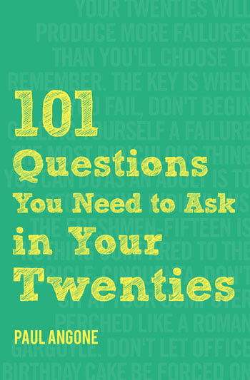
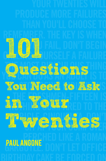
Right now, I’d love your opinion on which book cover you like best. Check out the three book cover options below and let me know which color you like best within the comments on this article.
I’ll be bringing your thoughts with me to Chicago next week as I meet with the publisher. I’d love to hear which cover you are most drawn to. Let me know in the comments.
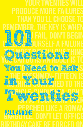


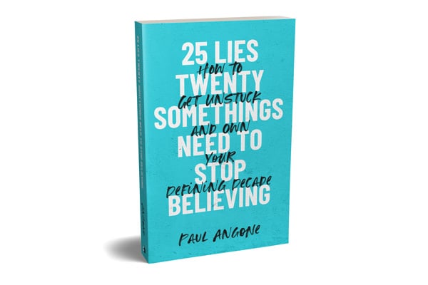

Yellow! Feels thought provoking and hopfeul. Something I’ll need as I get ready to move into my 30s.
Thanks Michelle. I promise there’s many important questions in this book to ask in your 30s as well 🙂
I really love the green one, because green is the color of new life/growth, and the yellow text adds a bright and hopeful touch. 🙂
Thanks Julia! Well put!
Yellow at first was too much, but it did grab my attention – and then I wondered what different colors mean: here is one such list and yellow certainly seems your audience: http://xtremebrandmakeover.com/color-meaning-chart/
Thanks Jason! Thanks for sharing that link as well. Awesome seeing what the colors represent. Great points
I like the yellow one, it looks colorful & lively!
Thank you! Great input.
The Yellow one realllly stands out! If I was walking around Barnes & Noble, it would definitely catch my attention 🙂
Thanks Samantha! Really appreciate hearing your opinion. Hope you’re doing well.
Can’t wait to read it, Paul! I’m going to be the boring one that likes the blue cover the most haha! The yellow one is my runner-up, though. It does stand out — in a good way!
Thanks Joel! That’s not boring! 🙂 Appreciate your thoughts as always my friend. Hope you’re well.
At first I liked the yellow one, but I think blue is best. Since the font is pretty light on the yellow one, it makes the text less substantial. I think the title “pops” much better off the blue one. If you go with yellow, I’d look to find a way to darken or strengthen the text. Just my two cents. Excited for the new book–congrats, sir!
Perfectly said Kyle. Thank you as always my friend for your opinion. It’s more like 75 cents!!
I think you’re spot on with making the text pop more on the yellow cover.
the yellow background with blue text is the one I’d be most likely to notice on a bookstore shelf, pick up and say “huh?” – they all look great, so there’s no wrong choice, but i’m particularly fond of blue-text-on-yellow and that color combo gets me every time.
Great thoughts Coral! Definitely helps to hear your thought process and what you’re drawn to. Thank you! We’ll see which one wins out!
I like the green background. My second choice would be the yellow background.
Thanks BreAnna!
Yellow. 🙂
Thanks Cally!
Yay, a new book! So excited 🙂
Tough question, but I like the blue with yellow writing best.
Thanks Megan! Putting some finishing touches on the book content now before it goes to full-fledged editing. Thanks for the vote on the blue cover.
Go for the yellow! Presents a bright and open future 🙂
Thanks Olivia! Great thoughts. Love that perspective.
Yellow definitely catches my eye the most!
Thanks Natalie!
Yellow! 🙂 Avid fan from the Philippines here! Hoping I can get our local bookstores to secure copies!
Thanks Gem! That’s awesome. Let me know if there are any ways I can help. Tell the Philippines I say “Hi” and I hope to visit someday.
The yellow book looks more youthful, so I’ll go for that cover!
I think it matches the energy and enthusiasm of young people who wants to make their life brighter.
Thanks Danica! Great thoughts. Love it
Yellow! It’s bright, and reminds me of sunshine. The vibrant color just like lemonade on a hot summer day. Can’t wait to have it on our local bookstore here in Indonesia.
Love the first design!
I prefer the green, because green is a soothing color, which is needed when asking yourself tough questions.